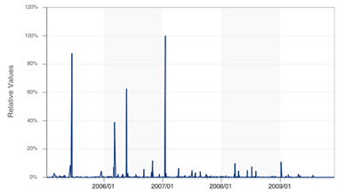
The detailed data collected by DataLossDB.org has been uploaded to two of the popular sites for visualization of data. The first is Swivel, and the graph from here shows the number of breached records as a percentage of the TJX incident where 45 million records were compromised (this is represented as 100% on the graph)
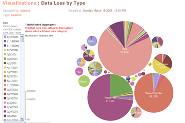
The “spikey” nature of the losses was identified by Voltage Security as the log-normal distribution. The DataLossDB data has also been uploaded to Many Eyes (several times it seems), and searching on data loss gives several graphs, like this one for data loss by type
You can use the loss data set at Many Eyes to produce other graphs of your own choice. Lastly, Voltage has a great graphic showing another representation of the relative size of data losses, which has a fractal feel to it


1 comment:
Looking best man suit for your company dress code try it at emensuits.com
Post a Comment